Draw Downs, Stop Losses, and the Real Risk

Draw Downs, Stop Losses, and the Real Risk

The TQQQ/URTY strategy can have peak to trough draw downs of 43.1% and trade entry to trough of 28.29% (MAE, Most Adverse Effect.) The risk is too high for some even though the rewards can be great. Let’s take a look at the worst cases. This graph shows the largest MAE.

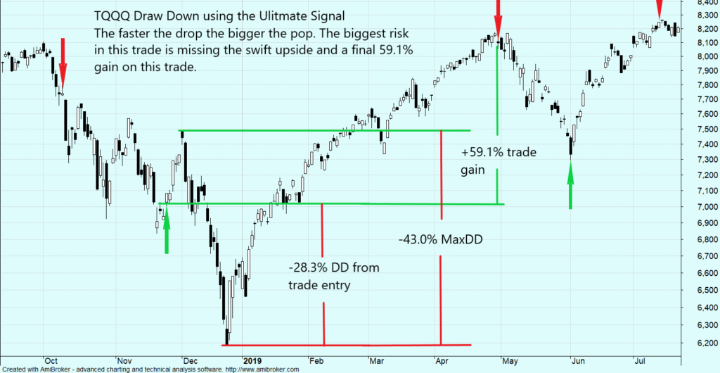
It only took 6 weeks from the trade entry date to fully recover and go on to make tremendous gains. The next graph shows the shows the worst case MaxDD% peak to trough.

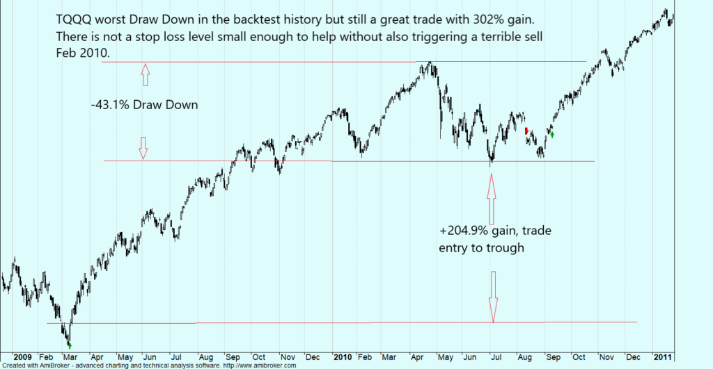
There may have may have been a -43.1% DD but that is small compared to the ultimate 302% gain. You would break even with the perfect stop loss level and would loose with anything else.

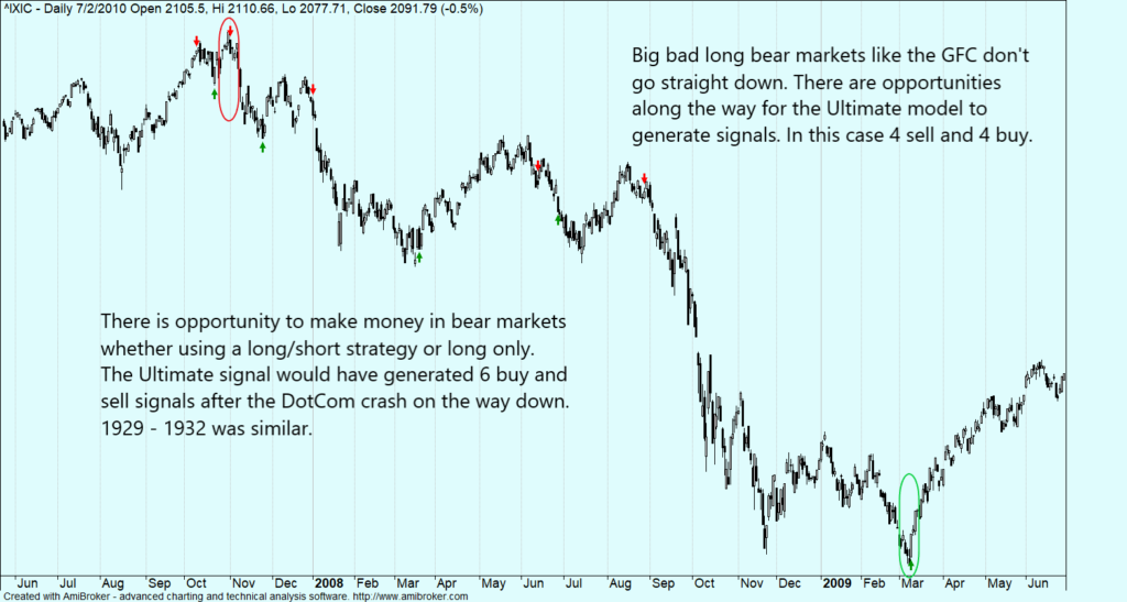
But what about a major bear market such as 2000 – 2003 or the great financial crisis?

The graphs put draw downs and volatility in context with the broader market.

When the market goes down, it always comes back up. But when the market goes up, it may never come back down to that level again. It is better to focus on being long in an up market than short in a down market. The market goes up 70 – 75% of the time. “The Real Risk”, being out at the wrong time.

Peter Lynch once said, “Far more money has been lost by investors preparing for corrections, or trying to anticipate corrections, than has been lost in corrections themselves.”

Sector Rotation from Large Cap Techs to Small Caps

Sector Rotation from Large Cap Techs to Small Caps

The small cap Russell 2000 has been on a tear since November. It may continue to outperform the NASDAQ 100 for at least the next few months. The NDX sharply outperformed RUT in the 1st half of 2020. Now the ratio is reverting to the mean. As the graph shows, the ratio has a ways to go before it hits the blue trend-line. RUT outperformed NDX for 6 years after the 2000 crash.

Performance summary for 2020:

Performance summary for 2020:

I’m sure you have heard 2020 was unprecedented, and it was. The model data-set didn’t have a market with such a fast fall, recovery, and new records. But now it does. This year will only make the model better.

The Small Caps have made big gains since I made the call in mid November. You may be wondering if it is time to switch back to the big techs. My analysis indicates Small Caps could continue to out perform for 6-12 months. The only time Small Caps have outperformed for a sustained period since 1990 is when they fallen way behind the Techs and then make a rebound (2000 – 2006). 2020 is only the second time Small Caps have fallen so far behind since 1990, although not as bad as the Dotcom bubble. They outperformed 6 years last time, so it is not inconceivable they could out perform a year or two now. It will be choppy. There could be rotation back to Techs if this new Covid strain really takes off and if vaccines have distribution problems, but it should be temporary.

I have developed an indicator to tell me when to rotate back and I will publish it.

The Ultimate model went live 1/15/2020. Trades are verified by an independent 3rd party, TimerTrac.

Happy New Year and may the odds be with you.